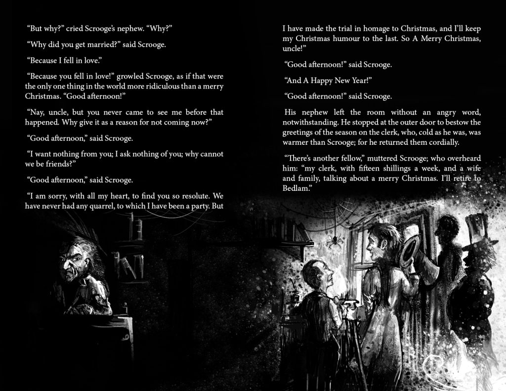
Illustrator’s commentary!
I worked on this book over 7 months in 2023 and I’ve written this page to show off a selection of the art from the book and to collect my thoughts on how I approached the project. Enjoy!
The fully illustrated edition of Dicken’s classic is available now on Amazon.
I still had writer’s block after completing Just so Stories and so I took a look around for another public licence classic to illustrate. I had a few possibilities – for example Shakespeare – but after discovering how expensive colour printing is I wanted a story that would really suit black and white art. A ghost story seemed to fit the bill.
I love Christmas, and the 1951 film Scrooge was a feature of every Christmas Eve of my childhood. It’s vital to only start a personal project that you’re 100% passionate about, and the combination of both this story and really wanting to try to illustrate a ghost story was ideal.
I began the project in the correct way this time, having learnt my lessons from Just so stories – I knew that I wanted the art and the text to be intertwined in the design, and also that I wanted to play with combinations of white and black text depending on the background. All this meant that the text had to match the placement of the artwork.
I knew, therefore, that I’d have to settle on the format of the book, font and font size from the start. I’d then need to work through the book mapping out where illustrations would go, and I knew that if something went wrong with the layout, any adjustment would lead to later illustrations needing to be changed. At least, though, I could split the text into chapters, meaning that changing text on a particular page would only alter the layout of just that stave, rather than the entire book. It was unusual working on a Christmas themed project in March, and even stranger drawing Christmas scenes during a July heatwave, but I wanted this ready for October at the latest.
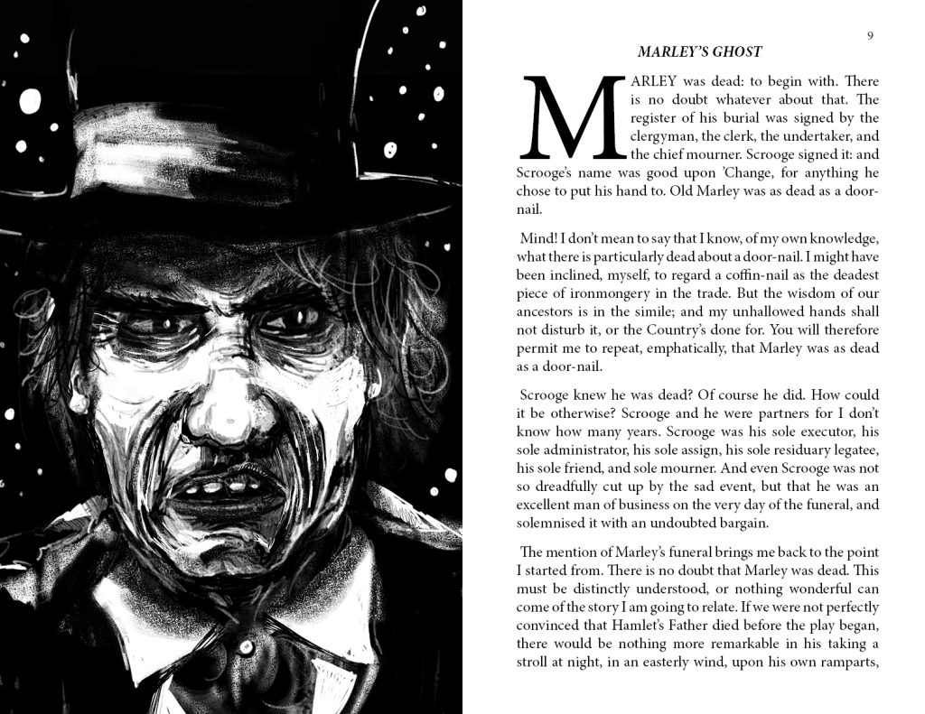
I began with a full page portrait of Scrooge himself as a proof of concept. This portrait went through a few revisions but is largely how I intended him to look from the off.
Alastair Sim is ‘my’ Ebenezer Scrooge – although based on my age, it probably should have been Albert Finney’s 1970 take. I was surprised to see that the next adaptation was 18 years later, 1988s Scrooged with Bill Murray, another firm favourite of mine now, but one of those films that we never watched at home when I was young but I was drawn to because it looked so damn cool and it was Bill Murray. It’s no wonder that my generation have glommed onto The Muppets Christmas Carol (1992) as the de-facto adaptation. This version is the one that’s become the Christmas Eve tradition now, although I’ll always watch the 1951 adaptation every year.
The reason I was most inspired by Sim’s Scrooge is that it’s the one film that’s genuinely directed and acted as a ghost story – the Christmas movie genre didn’t exist back then, really, after all. Sim also has that wonderful look about him that means he can convincingly be an ugly, miserable old miser AND the happiest, kindest man you’d ever hope to meet. Aware that I’d need to draw a character who could convincingly make this change, I set to work.
I had intended the book to feature cameos from actors from other favourite Scrooge adaptations, but this never really became possible. My first drawing of Scrooge began with his sneer – Sim does a great sneer. It’s a facial expression that perfectly captures everything going on behind the face. Scrooge is a man who sneers at everyone and everything because that’s how he feels all the time. The book opens with this portrait.
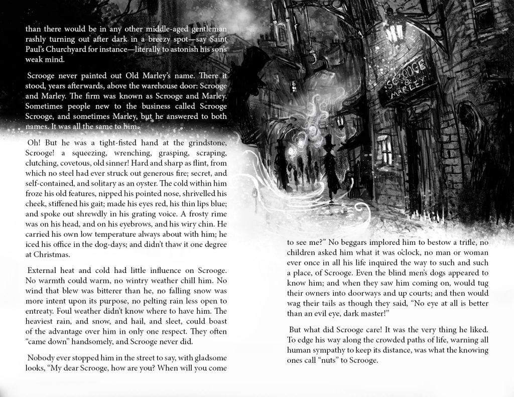
When I began drawing Scrooge’s street, I was struck by the revelation that I had no idea what his street would have looked like, because this would be determined by the building in which he worked, and this in itself was something of a mystery. Almost every interpretation and adaptation of A Christmas Carol has a different vision for Scrooge’s place of work. The book describes him working out of a warehouse – however in the slang of the time, this could also mean a storefront or office where the public could access to negotiate business. I’d definitely recommend this article More About the Business of Scrooge and Marley: an Ethnographic Approach | Folklife Today (loc.gov) if you’re interested in the business of Scrooge and Marley and what their firm was about.
Indeed, Scrooge’s place of work is also referred to as an office and a counting house. Adaptations have painted it as looking like everything from a chocolate-box Victorian shop-front to a dingy warehouse office. I discovered searching online that a popular theorised location is the suitably dingy-looking Newman’s court off Cornhill (which is mentioned in the story) and I used some photos of this area along with reference art from my treasured copy of Dore’s London as inspiration.
I already knew that I didn’t want to try and replicate the line art of Dore, and that I’d be working with purely digital brushes and focussing on atmosphere and doing something potentially a bit more abstract. This meant that I had the advantage of not needing to perfectly render the architecture that I wasn’t sure would even have featured in Scrooge’s life. I posted the first drafts of this page online and got good feedback and so decided to do the whole book.
Light and dark is a big theme in the book that Dickens references continually and I turned this into the main visual narrative. The book would begin with Scrooge always deep in shadow. Each ghost would bring different qualities of light, until the final chapter which would be the clear opposite of the first. I took a bit of a gamble with white text on black and kept my fingers crossed that Amazon’s standard print quality would be good enough.
As the book says – “Darkness was cheap and Scrooge liked it”. What with the current price of electricity, I can’t help but agree with him.
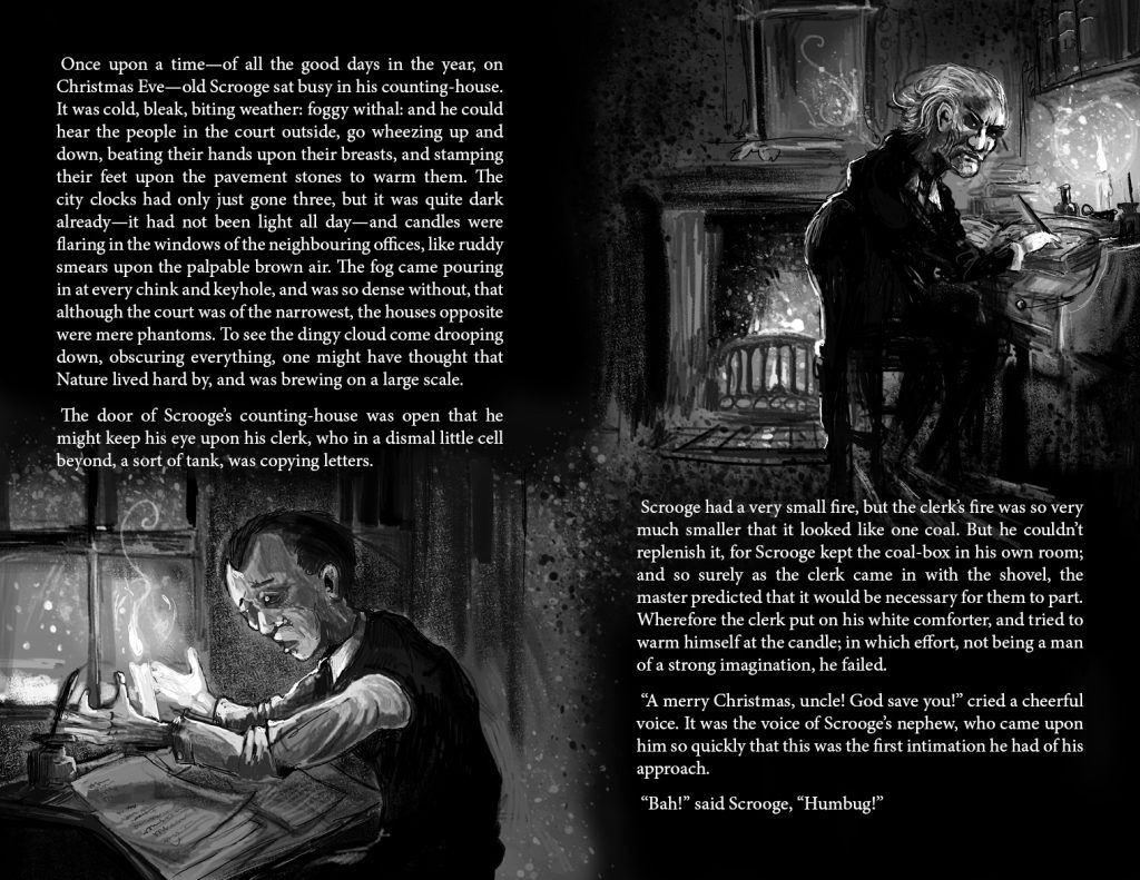
In the opening scenes Scrooge remains solitary (as an oyster) in the darkness – the darkness keeps him hidden from others and enables him to remain alone. It was also important to have him alone in his illustrations, and if another character entered the frame it would be an intrusion. These illustrations introduce another main character – Bob Cratchit. It took me a little time to settle on a look for him. I was never entirely satisfied with his portrayal in many of my favourite adaptations – either he looked too well-fed or never came across as the sort of employee who’d suffered under Scrooge for many years. I needed a man with the look of someone who worked long days for at least six days a week for the absolute minimum of pay, whilst (despite his inherent optimism and positive outlook) in constant turmoil due to his family situation. I eventually drew him in early middle-age, gaunt and prematurely aged, and it’s occurred to me writing this that Kermit the Frog might be the most appropriate actor.
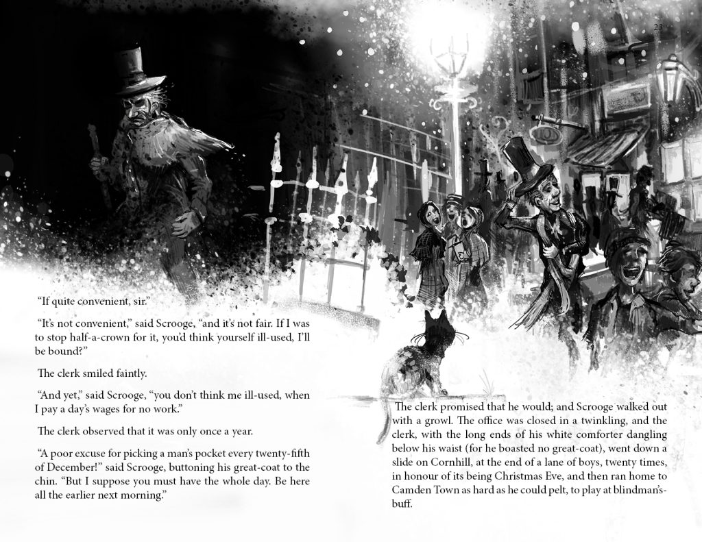
Again, Scrooge is alone in the dark and the years fall off Bob as he travels home for Christmas. Bob is also never alone – being together with friends and loved ones, and being part of the wider society is Dickens’ real concern with this story.
This was a page that was ideal for contrast and level balancing when it came to getting proofs printed. Even without having to worry about quality of colour, there was plenty of trial and error in translating the screen to the page.
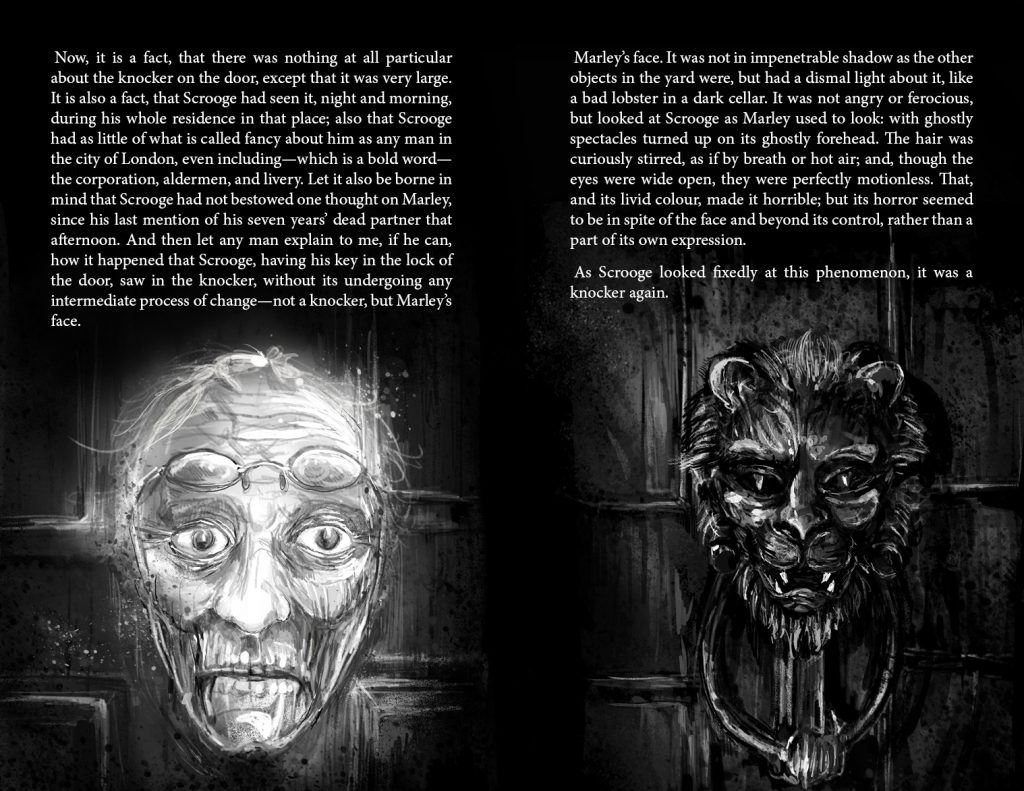
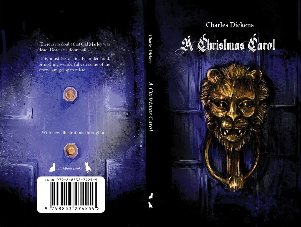
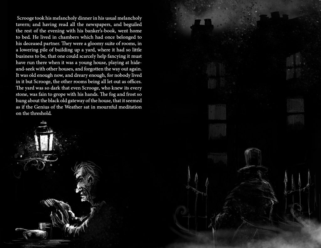
This spread eventually became the covers. The cover is always the hardest thing for me and I deliberately left it to the very end of the process so that I’d have every other drawing to refer to. It was a happy coincidence that the text arrangement fell perfectly in place – I was very smug with myself that I hit on the idea of having the reader turn the page as Scrooge opens the door and they both see the bolts of the knocker on the rear of the door/ page.
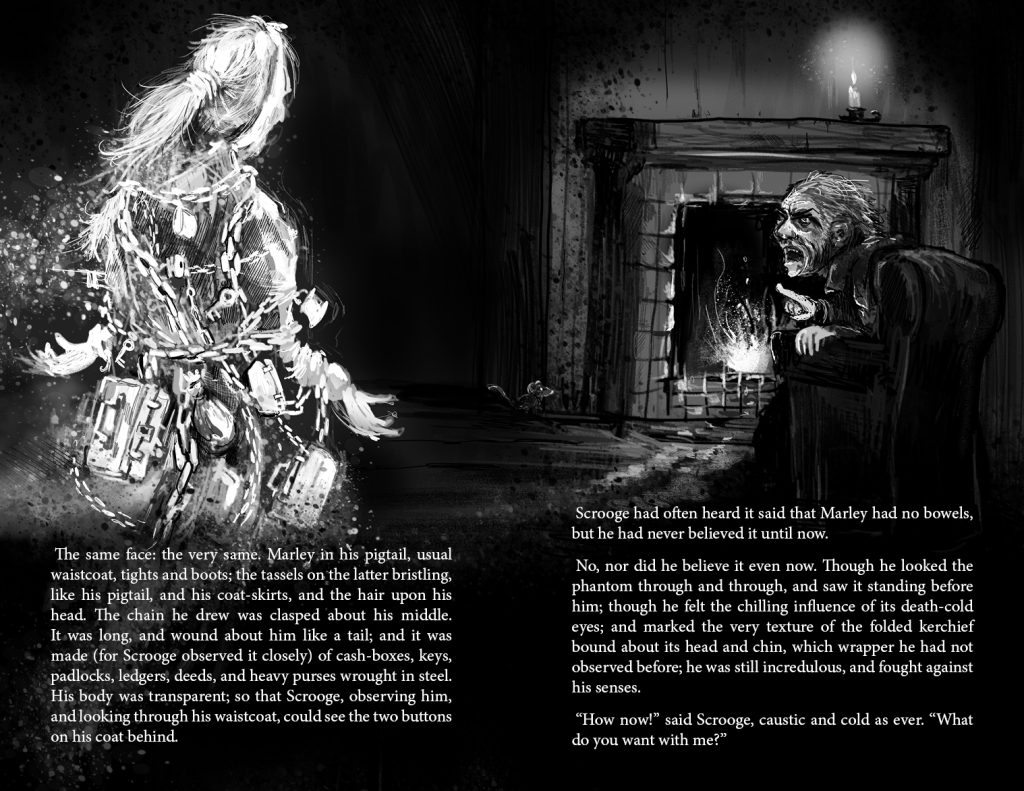
Marley is here bringing the first hint of light into Scrooge’s dark life. I stuck with Dickens’ description and hinted at some translucency to Marley – you can make out his teeth and scull through the skin.
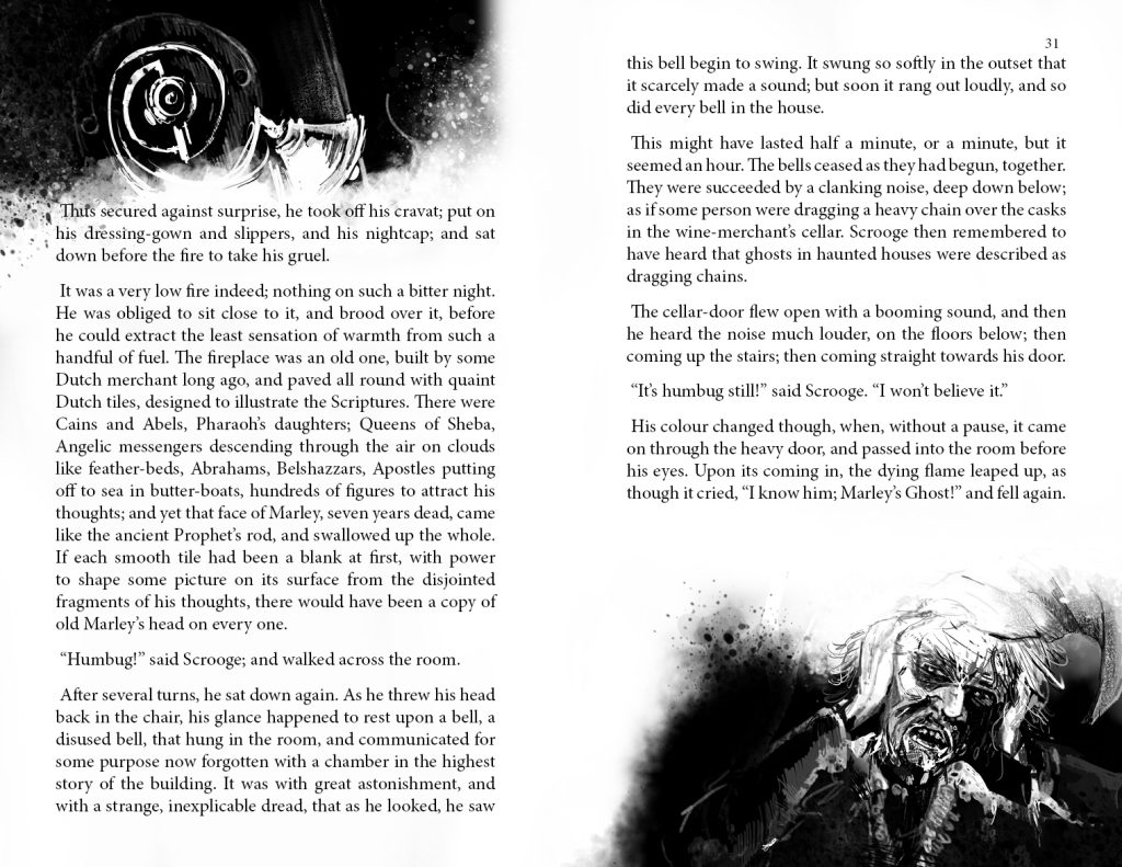
I had access to an original servants’ bell in my library – they’re actually quite interesting things to draw. Most of the art that I’ll be showing will be the larger pieces, but some pages lent themselves to smaller illustrations. In the end roughly every other spread was illustrated.
Marley was mostly inspired by the portrayal in the 1951 film – I think this shows the best balance of anguish and regret and desperation to help his old friend. It also did a good job of putting onto film the very challenging visual of Marley’s jaw dropping to his chest as he removes the bandage from his head. It’s a very odd visual and I’m not sure what inspired Dickens – ghosts in classic stories traditionally have visual gimmicks, but there’s no clue as to why Jacob’s jaw is bound in this way. It’s certainly a visual that ruined the 1970 film adaptation – watching it as a family, we burst into laughter at the clumsiness of it and didn’t watch much more. The 1951 film used a great device of the jaw dropping slack as Jacob announces himself to Scrooge, accentuating his misery as opposed to just looking gormless!
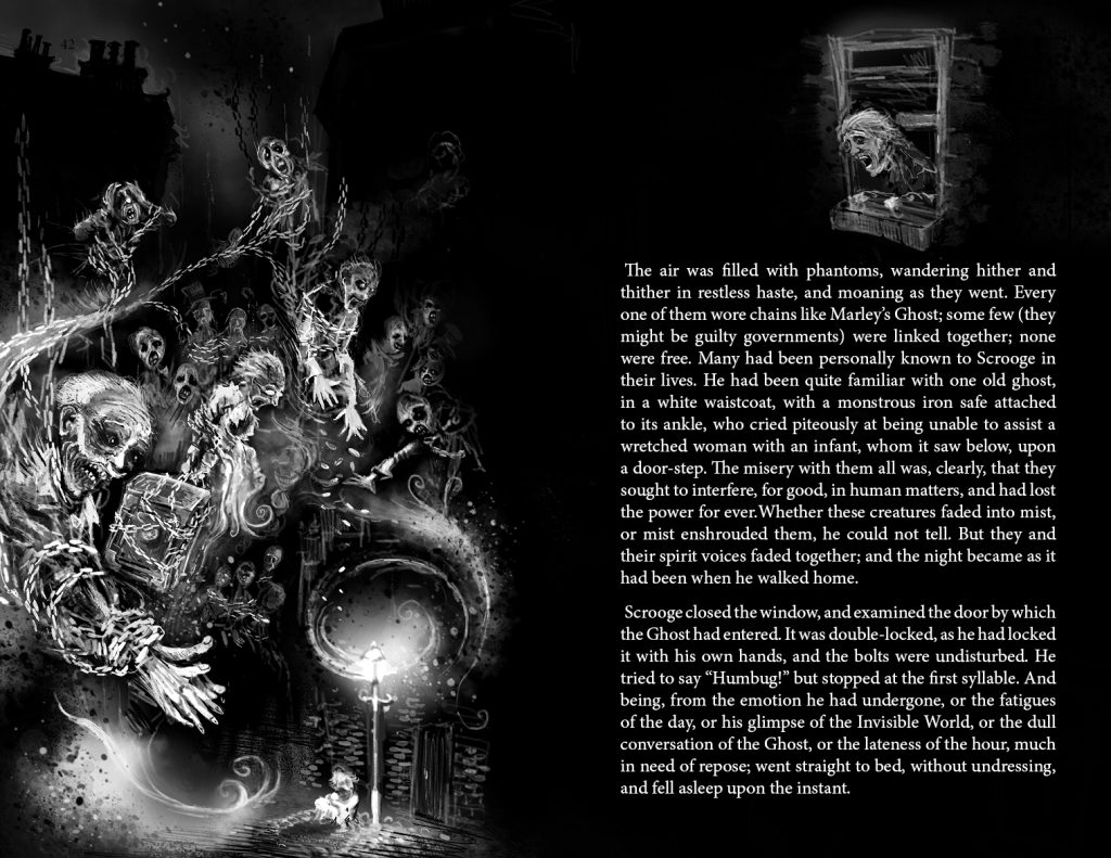
There’s a slight nod to Mike Mignola with some of the faces of the lost souls – the ones with the skin drawn back from their mouths exposing their teeth. I really got to enjoy drawing the silhouettes of buildings against the smoky, snowy sky. The lost souls forming out of the mist also reference the fog that has been following Scrooge in the other exterior scenes – they’ve always been with him.
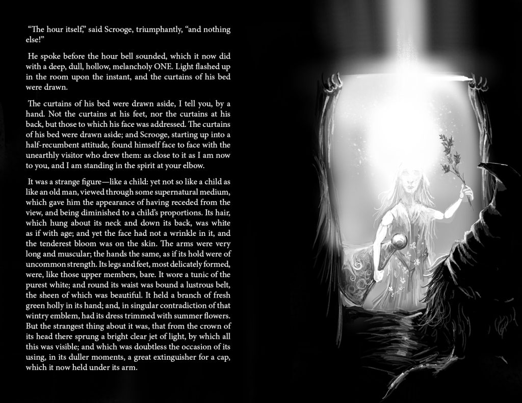
The Ghost of Christmas past was drawn as closely as possible to the description in the book – this character probably has the most variety of appearance of any in the various adaptations.
The past is a much brighter place for Ebenezer – until he snuffs out all of the light in a fit of rage. He resents being shown his actions and we discover that he doesn’t want any light shone on his behaviour. It’s at this point that we realise that Scrooge is basically going through a course psychiatric therapy.
This scene was a deliberate reference to my own childhood memories of Christmas. To ensure that I didn’t get out of bed too early on Christmas morning, my parents told me as a very young child that Father Christmas always switched on the landing light once he’d delivered his presents, therefore I’d inevitably be sitting up awake in bed in the early hours waiting for the light to appear around the doorframe…
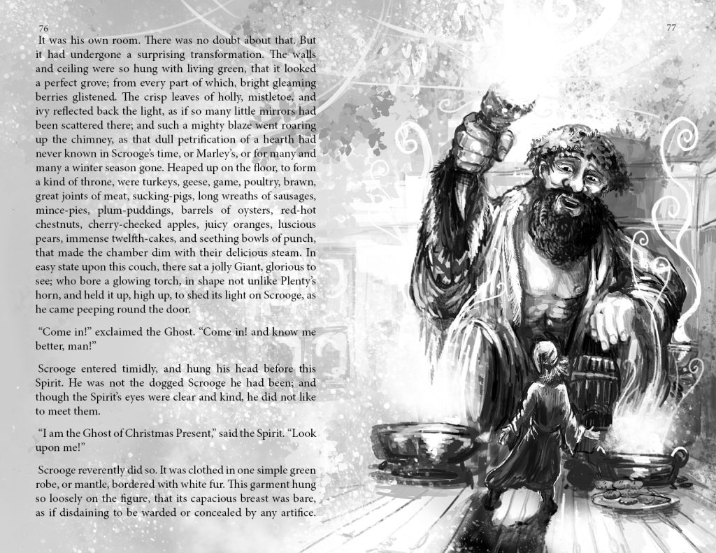
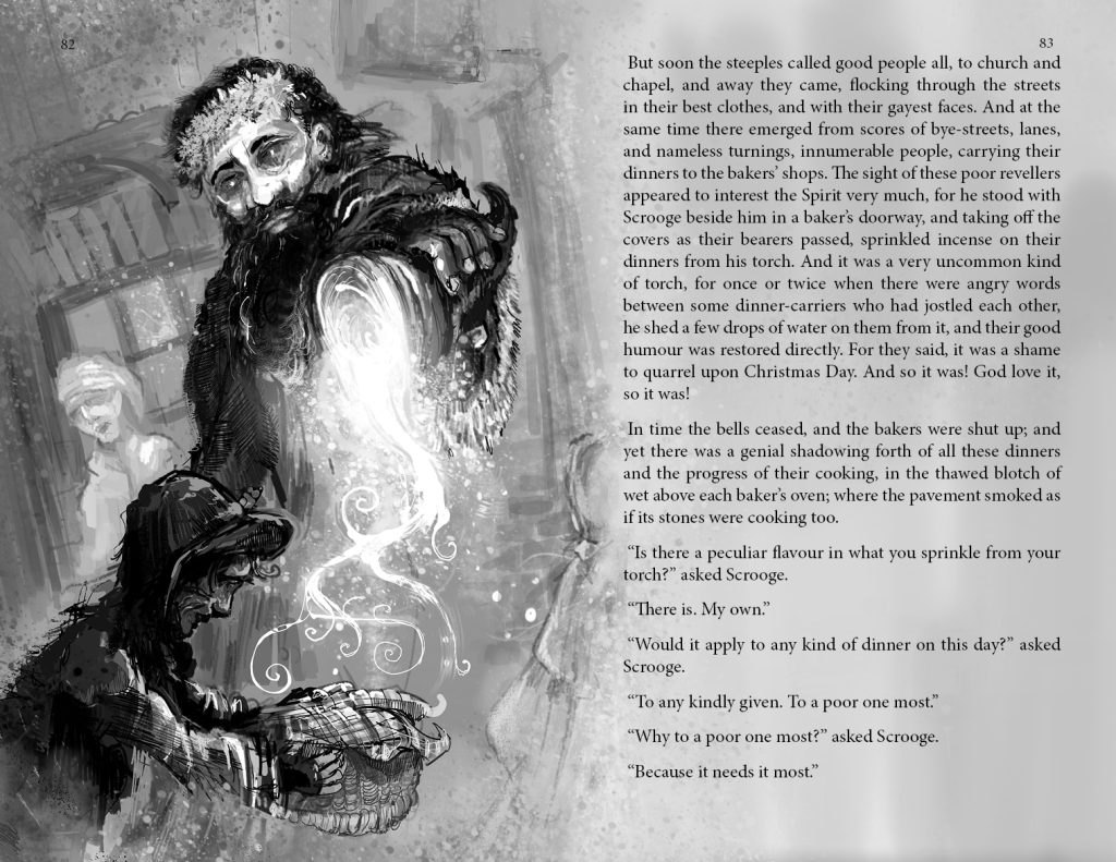
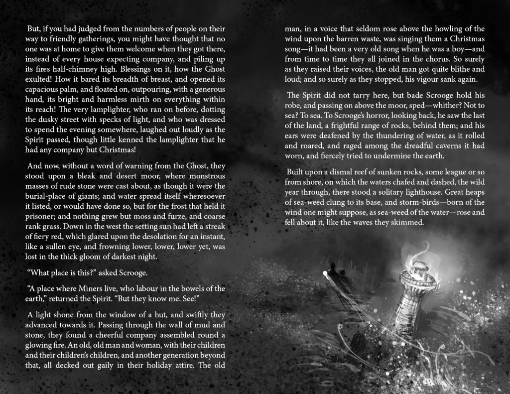
There’s a lot of classic folklore references as well as ghost story archetypes in this book. Christmas Present didn’t need a lot of thought in terms of working out visuals, though the scene of him sprinkling his blessing on the people in the streets and their food is not one that shows up in many adaptations – it’s possibly skipped over due to the amount of dialogue that directors and writers may have needed to put in. Indeed, Dickens inserts a very specific political grievance into this part of the story that is entirely relevant to his time – it took a Google search to interpret the meaning which has been lost on modern readers who don’t have the necessary historical knowledge. If the last chapter was about the importance of Scrooge knowing himself, this chapter is about the importance of him knowing others, and it’s clearly a subject that Dickens is passionate about.

The Ghost of Christmas Present doesn’t show an idealised Christmas – he shows a grimy, imperfect world but one which the light of Christmas can make better.
I really like the description of how brief the life of the spirit of Christmas is and I really wanted to capture him fading away – it seems that even in Dickens’ time, Christmas Day was over too quickly, though this is the point.
I thought it was time to switch this back to the look of a proper ghost story. My illustrations of Tiny Tim were inspired by photos of the children of the ragged schools and this one took it to an extreme.
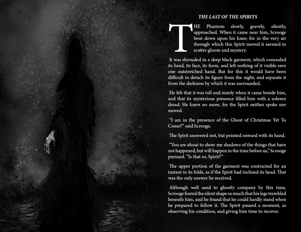
Another picture that I needed to adjust to get it the correct shade for printing. I knew that this chapter would be almost entirely white text on black – Scrooge is being shown the worst possible future if he doesn’t learn to bring light into his life. This is the only dark ghost and he’ll need to bring the light of the other two to banish it. It’s all very symbolic.
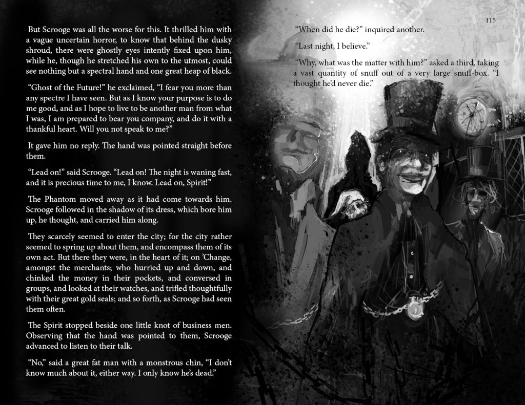
I was influenced by the soundscape of the BBC dramatisation staring Michael Gough as Scrooge and with Terry Jones narrating (quite the cast). It’s an extremely difficult recording to track down – it was broadcast back in 1990 and I taped it off the radio. I found a copy on Internet Archive. I’d really recommend it and it’s quite possibly my favourite adaptation in any format. This chapter is accompanied by a very eerie soundscape and indeed this is an as-yet unformed world. I drew much of it quite distorted and even more stylised. The businessmen here are indistinct but you can see the chain motifs creeping back in. The clock shows no particular time.
The above are a couple of scenes that also rarely appear in adaptations – Scrooge in his bedroom and Bob holding vigil over his son. I deliberately drew the latter by inverting the first. It’s a little on the nose, but I wanted the emphasis on how different the two deathbed scenes are.
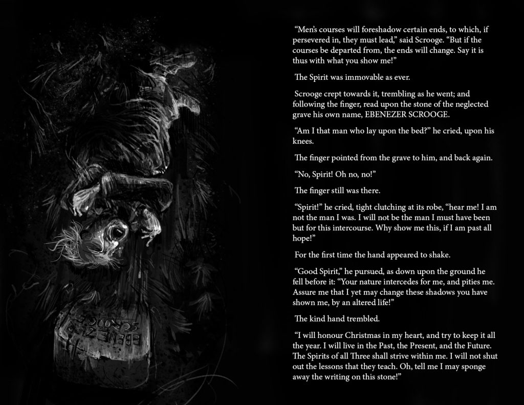
Finally we reach one of the most famous scenes. I decided to draw Scrooge in this way just to emphasise how his world has been turned upside down. He’s completed his journey and returned a changed man. He’s also in the position of a baby being born – appropriately he would describe himself as a newborn.
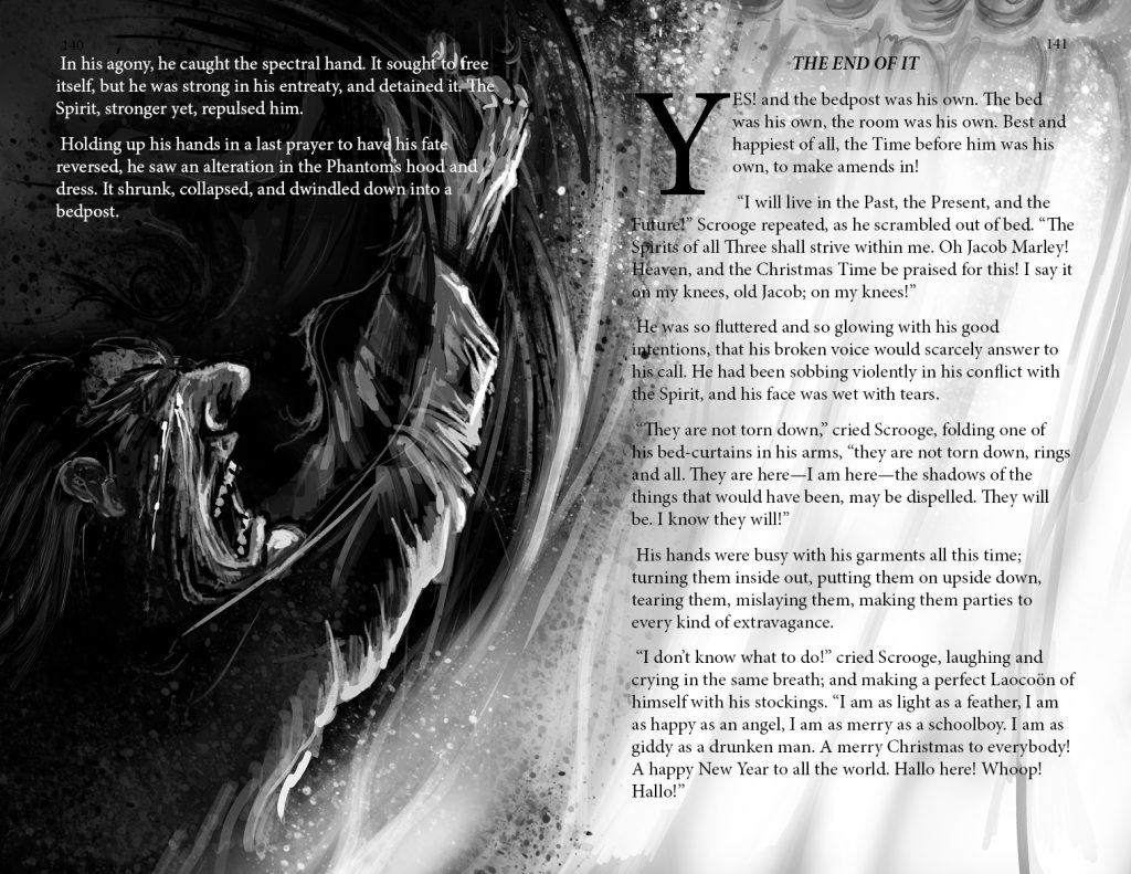
I almost lost the curtain being torn in the page binding, so expanded it. There’s a luminosity here that was sadly diminished in the print – I drew this very very quickly in order to properly capture Scrooge’s mania.
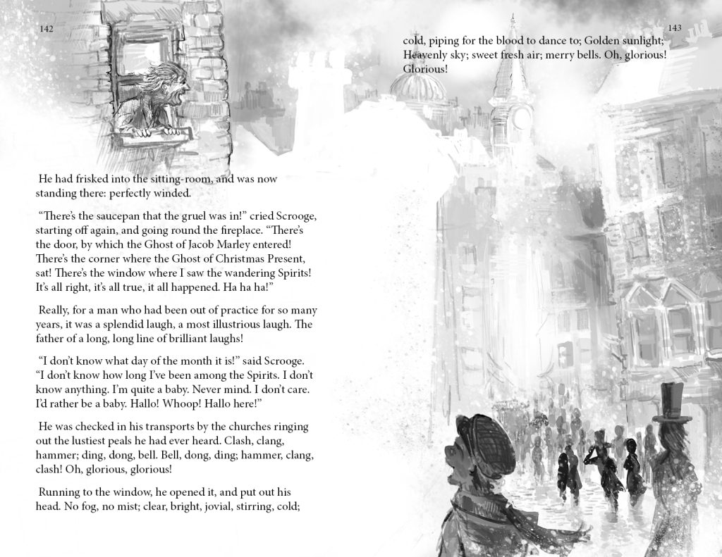
Finally, just as I flipped the deathbed scenes, I created this page by flipping the spread with the lost souls. The world is fresh and bright and the black background pages are no more!
At 58 double page spreads with illustrations, this is the biggest project I’ve worked on, though the style meant that it took the same time to complete as my other books (around 6 months). This was probably helped by all the lessons I’d learned after Inn from the Cold and Just So Stories, which were much more problematic.
I went to print in September, going through 3 proof print-runs. The first was an utter disaster which terrified me that I’d made a terrible mistake with the b/w format – but it was just down to a printing press error. Every other spread was badly faded as though there was a problem with the fuser. This does demonstrate though how money and time can be wasted because of technical errors. It’s also sobering that a customer may order a copy and get a similarly poor copy. The next proofs were an exercise in getting the grey balance correct and also getting the cover colours correct – eventually settling on the gold on blue.
Would I do anything different? Probably hand-draw everything before re-working digitally – particularly the faces. But overall I’m pretty happy with the package as a whole.