This is an illustrator’s commentary on this project as well as a showcase of all of the illustrations. I hope that it’s of some interest to those readers who are looking for insight into the creative process.
The Just So Stories : available now from Amazon
The just So Stories have been a part of my life since I was little. My Dad used to read a number of them to me and like most listeners I had firm favourites which dominate my memory. In fact, there were at least two stories here that I’d never actually (as far as I can recall) heard or read before I started illustrating them in 2022.
The cover was the last piece I drew and was designed to bring all of the stories together rather than just be a piece re-used from the interior. The stories are all set at a time when the world was both larger and smaller, and Kipling plays with size and scale a lot. I realise it’s another blue/ purple piece…
I intended the back cover to be a mysterious, primeval forested area where anything could emerge from, all set against a magical star/ skyscape. I just needed to convey from the start that all of the stories in the book operate outside of normal rules and logic. These aren’t animal stories – they’re mythical creature stories.
The title text is – of course – made out of the letters that Taffy and her father create in their story.
The Whale is possibly my favourite picture in this book. Kipling likes accentuating the scale of some of his creations, and the Whale is truely massive – though I couldn’t make the sailor and his raft too small otherwise they wouldn’t be seen. When I started work on this book I’d been shown a technique for creating bloom effects for lighting and I may have got a little carried away. This was one drawing that was pretty much 100% photo reverence as I’d never drawn a whale before.
The smaller piece was partly photo-reference (whales are tricky to draw from the side. The eye is obviously not realistic. The Stute fish is based partly on a guppy. Originally you could see part of the whale’s mouth, but with this composition it looked daft and without it the whale looks even bigger. The shading was designed to emphasise the underwater lighting.
The story of the camel is one of my favourites and a great one to read aloud – just to be able to say “Humph”.
I didn’t fancy drawing the other animals in the story – the camel is by far the most interesting, as is the Djinn, and the interaction between them. This is the first of two Djinn in the Just so Stories – the second being completely different and in The Butterfly that Stamped. Indeed, Kipling made no attempt to make them visually consistent – the later Djinn look far more like giant angels. There are also several deserts in this book and I knew from the start that I wanted them to all look unique – after all the Arabian desert looks very different to the Australian outback, and I accomplished this with a combination of colour choices and brush tools.
The desert here is called ‘The Howling Desert’ and so I added a lot of wind and dust storms – the Djinn notably travels in a dust cloud or dust cloak. There’s lots of swirling sand and magic here. The Djinn matches the colours of the desert that he belongs to. his outfit was designed not to conform to any particular religion. I gave him a turban after tradition, but didn’t go with the blue skin of the Disney ‘genie’. This is the sort of Djinn that would exist in the pre-Islamic world. His cloak is magic which is why it lacks normal shape – the Djinn himself is not entirely corporeal.
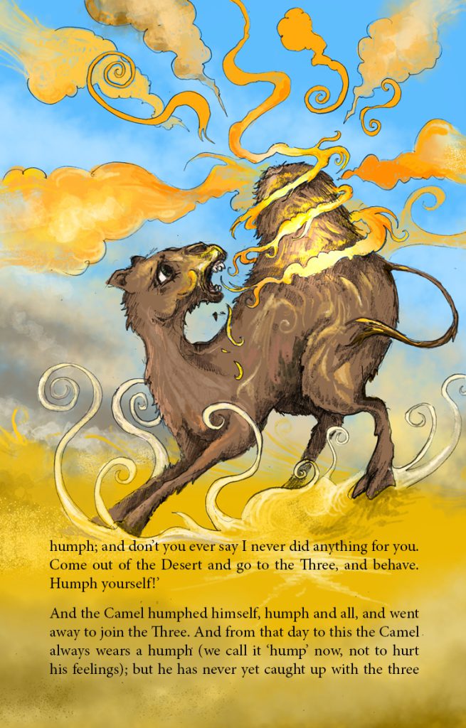
I knew that I wanted to show the camel growing his hump in the second picture. The magic is a mix of fire and dust -appropriate to a Djinn and it was fun drawing a very different expression on the camel’s face.
How the Rhinoceros got his skin is another great story to read aloud. It’s the first story that I needed to do a lot of research for. Kipling’s treatment of the illustrations is unconventional – both his renderings of the Parsee are almost entirely different and he doesn’t draw the stove at all (he says the least said about it the better, which I guess means he had no idea what it would look like and neither do I). I had to research who or what a Parsee is and it turns out he’s a descendent of Zoroastrians. He’s also described as not wearing any clothes except a hat, and I was able to look up (roughly) what this hat would (possibly) have looked like.
The Parsee and the Rhino weren’t the only things I needed to get photo reference for. I researched the Red Sea area and the background in the main picture is the result of this. I’m not sure how sandy the shore would have been, but I wanted the Rhino skin to be extra itchy. I was especially interested in getting a distinct and accurate colour palette for the hills to distinguish this from geographical areas in the other stories.
We’ve already discussed the controversies with the story of the Leopard and the Ethiopian, so I won’t revisit them here. This was a story where I’d considered having light text of a dark, patterned backgrounds suggesting forest foliage, but it just didn’t look right. I’m quite proud of the main picture, though. It was definitely tricky – and is also one of the closest to Kipling’s originals (outside of Taffy’s stories). Kipling’s original drawing is much more indistinct – he’d envisaged it as a ‘spot the animal in the shadows’ style piece, but it’s all very indistinct. I wanted to strike a balance between the giraffe and zebra blending in but not having the background a mush of trees. As much as I like drawing cats, I still had to do photo reference for the leopard, and I’m particularly fond of the lighting in this scene.
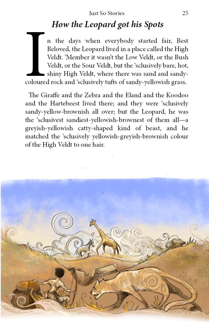
The smaller illustration is of the high veldt in all its beige glory. I made a particular effort for the man to be the same shade of yellow/brown as everything else, rather than white
The Elephant’s Child is my all time favourite of these stories, as it seems to be for so many, given how often this story seems to get re-printed. I’ve never understood why Kipling didn’t title it ‘How the elephant got its trunk’, though. The story is wonderful to read aloud – with lovely repetition and – when we meet the crocodile and the python – well crafted dialogue that begs the use of funny voices. There have been beautifully illustrated editions of this story in the past – sadly and inexplicably accompanied by re-written text that captures none of the joy of the original.
I’m not so bad with elephants, snakes and crocodiles, so my main reference for the animals for this story was for the particular colours and markings of the python. What I did have to look up were photos of the Limpopo river, which wasn’t nearly as grey-green and greasy as the story makes out. In fact – unless the photos were retouched to attract tourists – it’s actually a pleasant shade of blue. I couldn’t be having this, so while I used accurate colour reference for the banks and the trees and foliage and sky, I added a grey/green tint to the water.
I also absolutely love Kipling’s original art for this story – it’s probably the best of the whole book, particularly the composition. I couldn’t bring myself to copy it wholesale, so I drew the elephant face on with the crocodile and the python almost mirroring each other as they compete for the hapless pachyderm. What I did want to ensue I got right (at least as far as I think it’s right) is the age of the elephant – Kipling’s elephant looks older than I feel an elephant’s child should, and so our hero lacks tusks and looks quite young and helpless.
The smaller illustration is purely for comic effect – showing the elephant (freshly spanked) running away from the animals irritated by his insatiable curiosity.
I’m not sure if I’d read ‘The sing-song of old man Kangaroo’ before I started working on this book. It may have been read to me once, but it wasn’t one of my favourites. Kipling’s art again shows some inconsistencies regarding the look of the gods in the outback. The second one he draws does have an aboriginal look, but the first is very odd with a look that could be Asian or European depending on your mood.
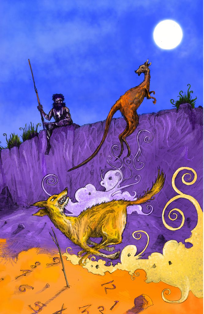
I took inspiration from his second drawing and portrayed Nquong as an aboriginal man, dotted with pigment. I’m not sure why I went for two full-page drawings here – it must have seemed right at the time. Nquong is in shadow in the second image – the sundial shows it’s getting later in the day. The purple shadows and orange tint to the ground are again to distinguish the outback from the other deserts in the book, and of course the Kangaroo needs to end up a dusty red from running through this land all day.
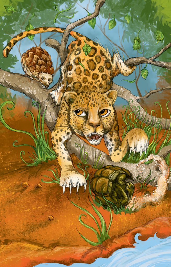
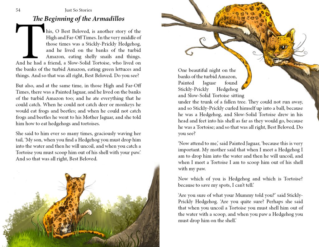
The beginning of the Armadillos was another story that either I’d never had read to me or that I just couldn’t recall. It was also one of the most tricky and one that I left right to the end. I just couldn’t make my mind up what to draw, and when I did pick a scene I had trouble composing it.
Kipling also seems to have struggled a little, as his illustration is more than a little abstract I chose the same scene and took a more literal interpretation, with the Jaguar getting confused by the hedgehog and the tortoise who we see are ell on their way to becoming armadillos – the hedgehog’s spines are fusing together like a pinecone and the tortoise’s plates are beginning to fold in on themselves.
What I found interesting about this story was that I couldn’t quite place it geographically, as traditionally the three animals aren’t native to the same country. However in the end I picked South America as it occurred to me that as they’d turned into armadillos, it didn’t matter that hedgehogs aren’t native to this continent. Of course, porcupines ARE native to this continent, so perhaps Kipling meant the hedgehog to be a porcupine.
The secondary illustration shows the young jaguar being given a lesson by his mother. I’m not 100% sure why she’s lost one eye – it certainly makes her look older and more worldly, and I think she probably lost it to a porcupine’s spine in her youth, hence her advice to her son.
How the first Letter was written (and it’s follow on – how the alphabet was made) were (again) stories I wasn’t so familiar with, and I’ll discuss them together here. They’re unique in the book as they follow the same characters, and in fact there was a third story featuring Taffy – the Tabu tale – which is difficult to find and apparently not published in UK editions. I decided not to include it in this book.
Until I actually read it myself when preparing this book, I didn’t realise the the ‘letter’ in question was not a letter of the alphabet, but a letter as in the thing you post to someone. The story is actually quite a fun one, if perhaps a little rambling before it gets to the real fun, which is as something of a comedy-of-errors story. Kipling’s art illustrates the ‘letter’ in question – the little girl Taffy’s drawing on bark which gets hideously misunderstood by her mother – and I had no choice but to illustrate the same thing as it’s essential for the reader to see it in order to properly understand what happens next and why. My mission was to make it clearer for the reader whilst also being clear that it would definitely have unwanted consequences. The stick figures were a lot of fun to draw.
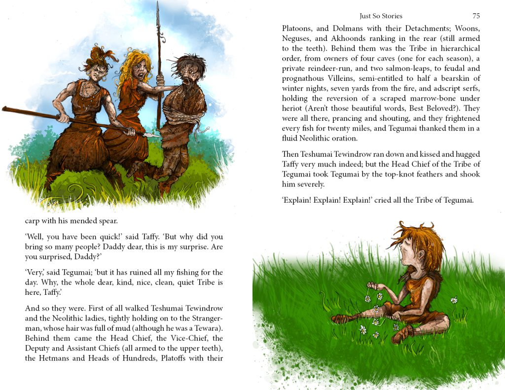
The second illustration is almost an anomaly in the book as it feels very different to anything else I’ve needed to draw, however I think this is just because it’s the first that features only humans. I kept the style in line with earlier pictures but went a bit ‘horrible histories’ with the humour. The story is very much about the differences between mothers and fathers and their relationships with their daughters. It’s a timeless recipe for conflict and comedy. The neolithic women are deliberately physically in command here and I didn’t want to draw the chief of the tribe as actually I think this is a proper ‘we know who’s really wearing the trousers here’ moment. Taffy and the women are modelled a little on Aloy from the Horizon series of videogames – particularly with some of the braids in the hair.
How the Alphabet was made is definitely not an especially interesting story to read aloud. It feels to me as though it was an interesting idea that Kipling came up with, but that it worked as a curiosity rather than something to entertain – writers are (obviously) very interested in language and words and this definitely something that he himself found interesting enough to write a story on, but it certainly doesn’t have broad appeal.
It was also something that I had been dreading illustration, but in the end it wasn’t too bad. For a start there are no real options for new directions here. The text explicitly references specific drawings that are required for the reader to understand the story. And as all of these required just individual line drawing of letters, there were limitations on how I could make them very different from the original. The drawing of the longer word gave me some scope, though, as I could play with making it a bit more decorative.
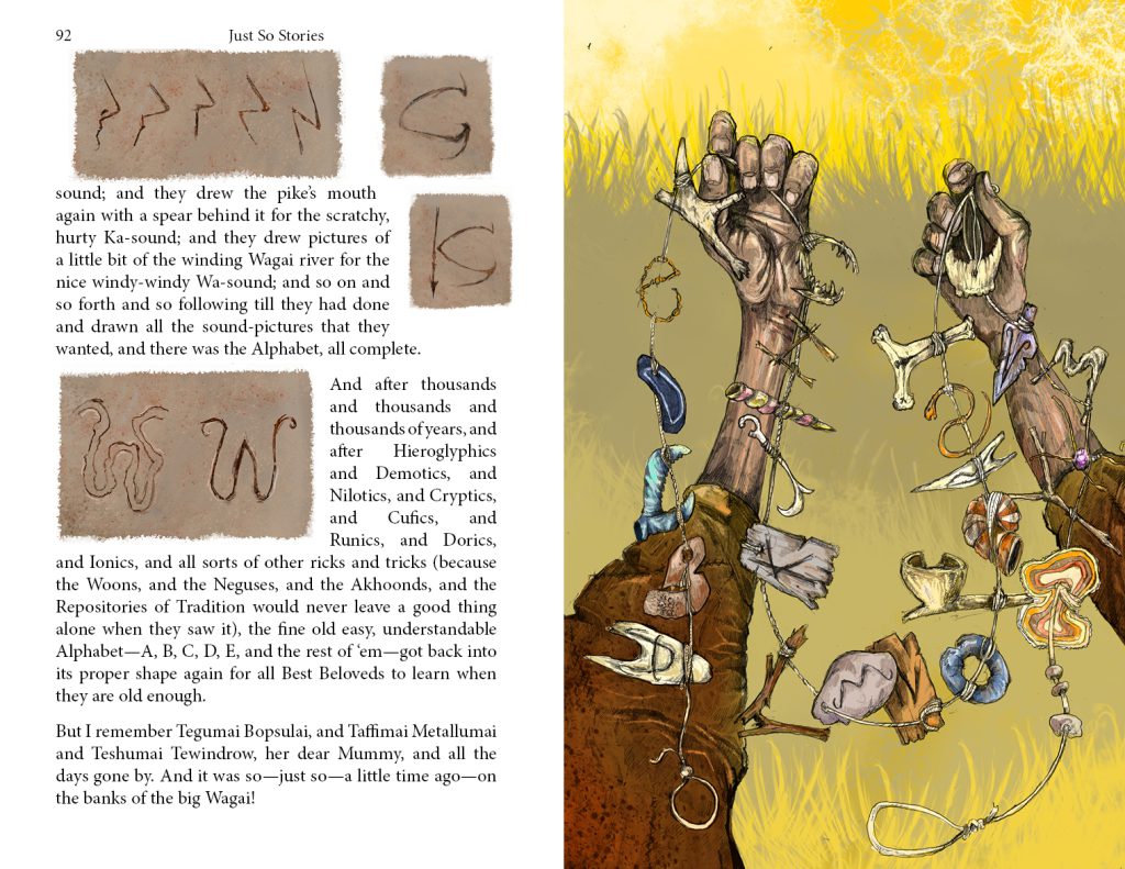
The full page illustration was also directly influenced by a Kipling drawing. He left this one for the afterword of the story – he always accompanied his drawings with descriptions, and this is the longest of them all. I haven’t accompanied my art with descriptions and so it would seem out of place to begin here or to copy Kipling’s description that isn’t actually part of the story. The picture was of the necklace that Taffy and her father made to remember the alphabet. I don’t think it requires a description as the reader can make their own deductions as to what the letters were made out of and why.
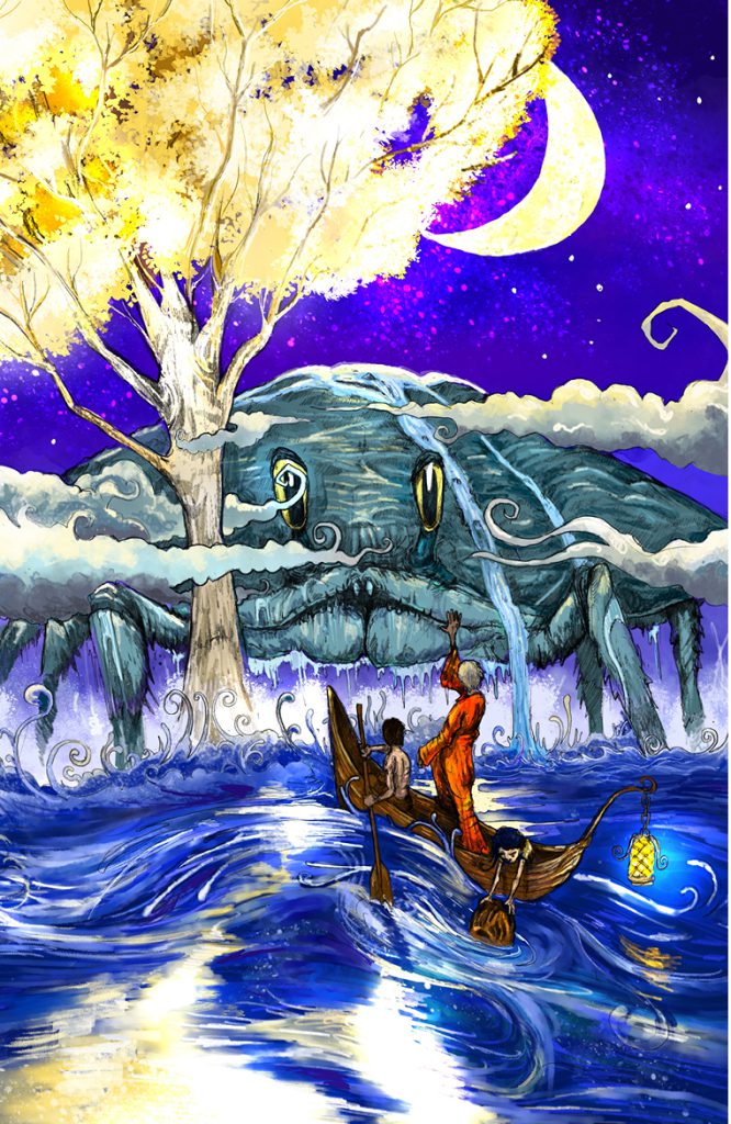
I’ve seen The Crab that Played with the Sea illustrated several times and it amazes me that the crab is often featured with his pincers, which of course he’s only gifted with at the end of the story. That said, it’s quite possible that I’ve misunderstood Kipling’s vision. The meeting with Pau Amma takes place in a hollow in the heart of the sea where the Wonderful Tree grows – now it’s not clear to me whether this hollow is down in the Earth below the sea, however as this is a story about tides, the moon plays a part, so I visualised the tree growing from the sea, or some kind of attoll (after all, I couldn’t imaging a tree growing underground). In the illustration, I tried to capture some of the massive scale of the scene, with the crab and tree looming over the horizon.
I was playing Elden Ring at the time of drawing this scene, which explains the look of the tree. Pau Amma is a combination of three or four different crabs – I wanted a a specific mountain-shaped shell, eye-stalks and mouth parts.
In the foreground is the great magician and the early Malaysians – the daughter picking the nut from the water. The story is – in what is either an insult or another example of racism – partly about the origins of the Malaysian people, or at least their name, derived from the name ‘Malazy’ given by the magician – the lazy people because they’d got used to having their boats moved by the pull of the tides. The setting of this story, though, is very dreamlike, set as it is at the dawn of creation and I definitely wanted the choice of design and colour to represent this.
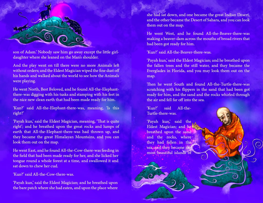
The secondary illustration is the one piece of art that has a full colour background behind the white text. I chose this because I wanted the world at this point to be just islands rising out of a strange primordial ocean as the magician creates them. Size and scale is fluid in this story.
This was the point where this whole project started. I’d been planning on writing and illustrating a book about cats – originally a lot of dad-joke puntastic illustrations but when I needed to add more content I turned to cats in literature. After drawing a few sketches of The cat who walked by himself someone commented that my animal drawings were really good and I realised that illustrating the Just so Stories would be a fun project, especially as I had some writer’s block after Inn from the cold.
It’s a very simple illustration showing the cat very confidently moving through the forest.
The secondary illustration is more abstract and was drawn when I’d intended the smaller artwork to be in silhouette an possibly just in black and white. I really liked the representation of the woman’s magic and so I kept it.
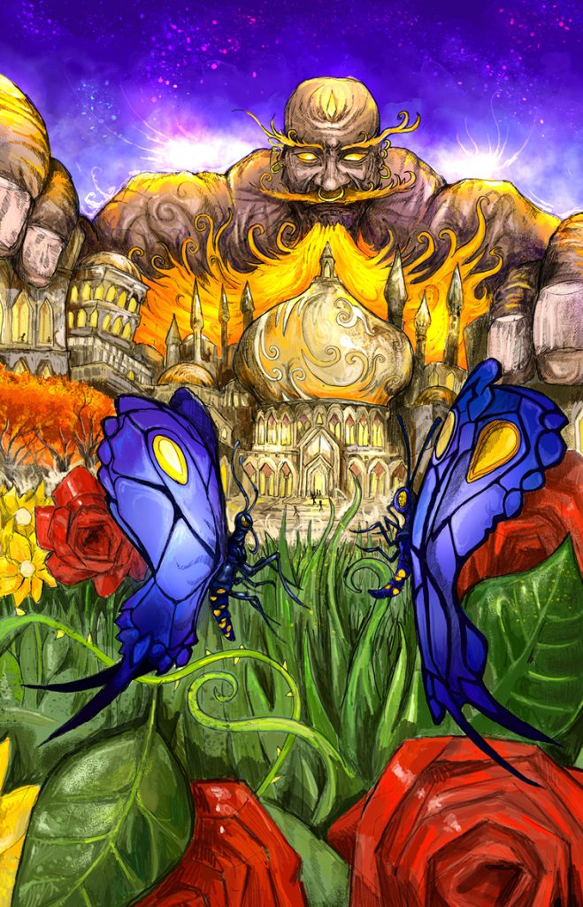
The Butterfly that Stamped is a story about the clashes between men and women and pride and there are plenty of gender stereotypes going on. The main illustration was a tricky one to compose, showing (scale again) the contrast between the butterflies and one of the giant Djinn. I wanted there to be more continuity with the Djinn featured in this book – the original art had them looking like great angels. The butterflies needed some photo reference and I hand to use the positioning of legs and the shape of the eyes to differentiate them. I included the roses to add some more interest and colour, and also for a bit of symbolism.
The other illustration shows the sultan despairing at the monster rising from the sea and eating the food meant for all the animals. I do like Kipling’s original design for the creature – he looks quite likeable (as he is, really) – but I felt the need to go in a different direction. It does need to look a bit scary and also like something that would live underwater.
And that’s it!
As I said, I went about this project badly it terms of actually designing a book. A book of this format absolutely wouldn’t be in full colour, or would have needed printing by a publisher that could handle full colour plates inserted in a b/w book. As it was, I doubled the number of illustrations to make it a worthwhile product.
As it is, I only make about 1p per copy sold, but I’m enjoying seeing that some people really like it and it’s not too pricey!