Inn from the Cold is one of my self-penned picture books that has been waiting for its completed artwork for some time now – along with ‘Don’t let the Dragons Bite’. Now that I’ve got a proper digital drawing tablet and have had practice with the Mighty Catterwhip, I feel that I’m finally able to do justice to these stories, especially in terms of being able to settle on a consistent style. In fact, I’m intending for all three of these stories to be set in the same world even though they don’t overlap.
Inn from the cold has been through a ludicrous number of revisions with its artwork, even though I’ve had the story pretty much down for the last five years or so. This (hopefully) final draft will be self-published as a paperback in 8.25″ square format.
In 2023, after getting more practice with digital painting via my work on the Just So Stories and A Christmas Carol books, I revisited Inn from the cold and made a few tweaks to the artwork.
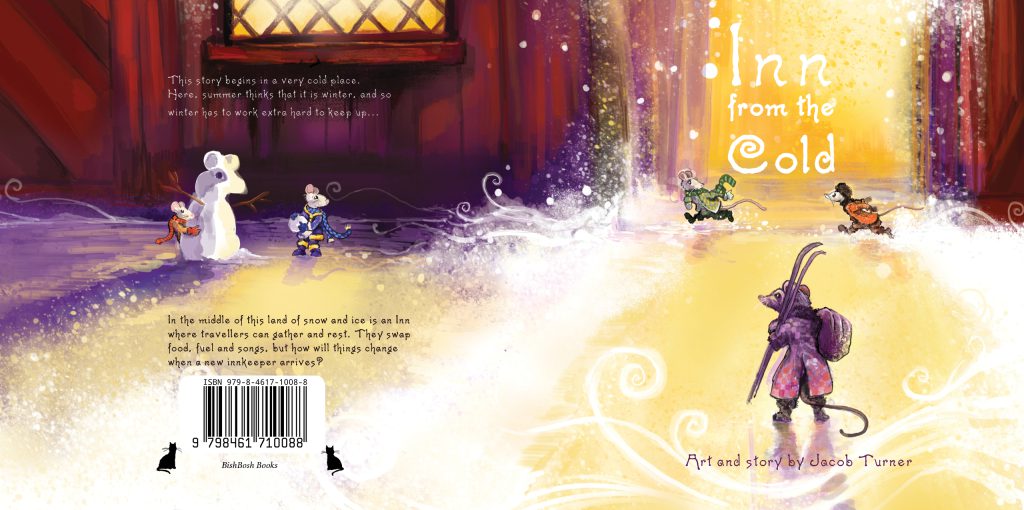
The story in its final form is an anti-capitalist fable told in the style of a traditional tale. Originally is was a story of immigration and of finding a place to call home. It still is, but I expanded upon this after I saw the damage that was being caused by the part-privatisation of public services, in particular schools and other public services where I work – of them being drained of money by greedy businessmen and women while the staff loose their jobs and take the blame for falling standards.
The story is set in the icy northern wastes where an inn is a lifeline to travellers and traders who live here.Visitors to the inn pay their way with their wares, their work and their stories, until it’s taken over by a man who only wants gold.
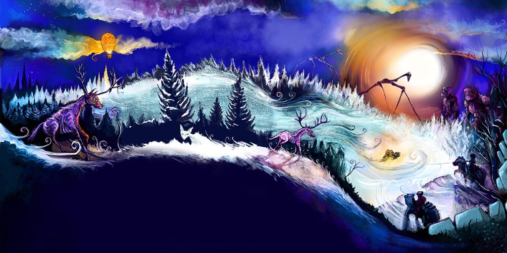
The opening spread has come a long way since the original painting below (which itself wasn’t the first draft).
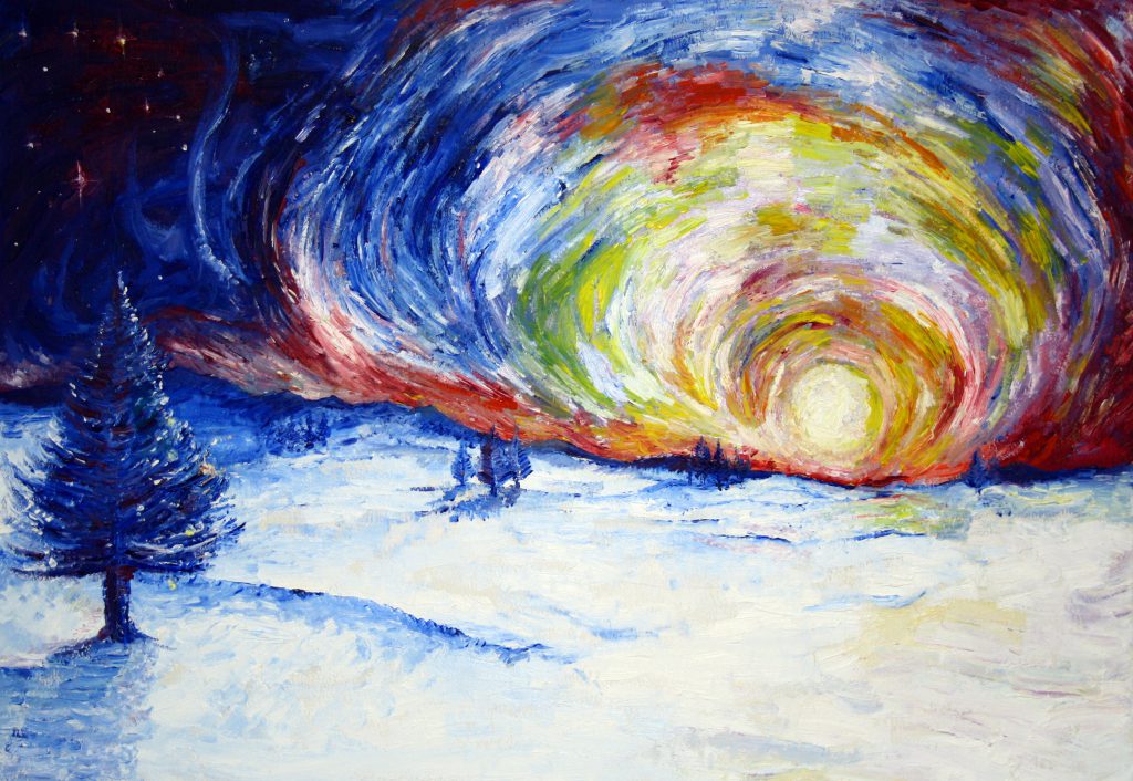
I still have a soft-spot for the oil painting, but I’d never have been able to get the detail required for the animals and characters. The biggest departure from my original vision was that post-Catterwhip I went all-out on adding fantasy creatures into the mix, whereas the original was fairly down-to-earth and far more inspired by John Burningham’s ‘Trubloff’. I’d originally envisaged Inn from the Cold set on the Russian steppes and I’ve kept a lot of visual nods to these influences. I particularly wanted an eastern European fairy tale ambiance.
The final image for the book has actually been horizontally flipped and is considerably lighter – the latter due to Amazon self-publishing printing lacking a lot of colour definition which makes the final book much darker, particularly with blues.
I also needed to think seriously about how to incorporate text into the page. My early drafts had the text in a frame outside of the images but the format shift to a square book meant I needed to get creative with compositions depending on the content of the picture and how much text there was and whether the sentences worked best in a landscape or portrait ratio frame.
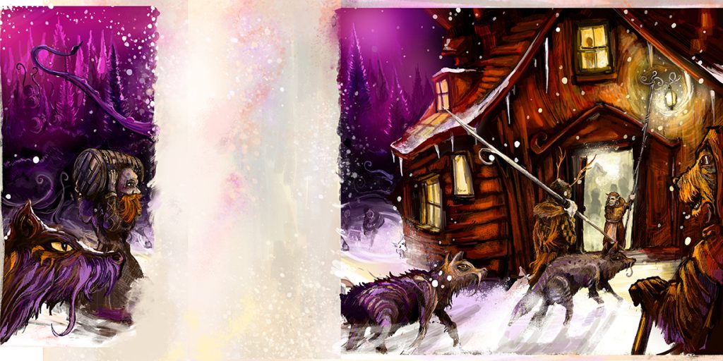
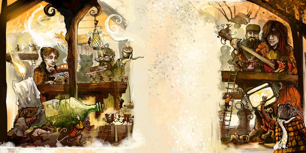
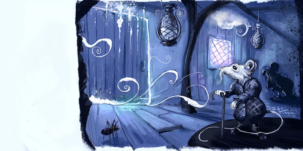
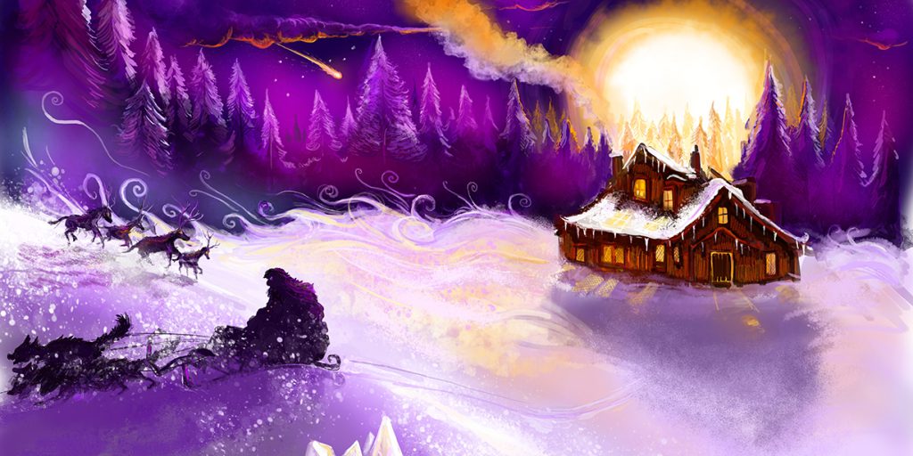
The next page zooms in on the titular Inn (that you can just see in the opening spread) with an assortment of travellers. Again, the characters and animals became more exotic with each draft which added more visual interest. The page format went through 4 or 5 revisions. I felt the book needed to have each scene as a spread, but for most pages, it never looked right with the text always overlaying the art, hence why I added neutral cutaway areas. When the pages were portrait format I had the text below, but the composition just felt dull. The square format really felt good, though.
The colours I’ve chosen are definitely unconventional. My choices were based on temperature. There were scenes which I needed to be simultaneously warm and cold.
I’ve definitely done myself in a bit with my liking for purples and blues – partly a hangover from The Squeeping Catterwhip and partly because greens and yellows didn’t work for me in this story. KDP printing doesn’t like colour definition for these shades.
The inn interior was always tricky for me. I needed to show the space, make it look interesting, and to also get the perspective of the rats! The final version of the text gave me the option for a double page establishing the interior. I still have a soft spot for the pen and ink version, though. I began working on this book in black and white after my Undiscovered Voices entry with my drawing of the witch and Hansel and Gretel and when I began drawing ‘Behind the shadows’ and my various monster encyclopedia pages, however I got mixed/ negative receptions at portfolio reviews.
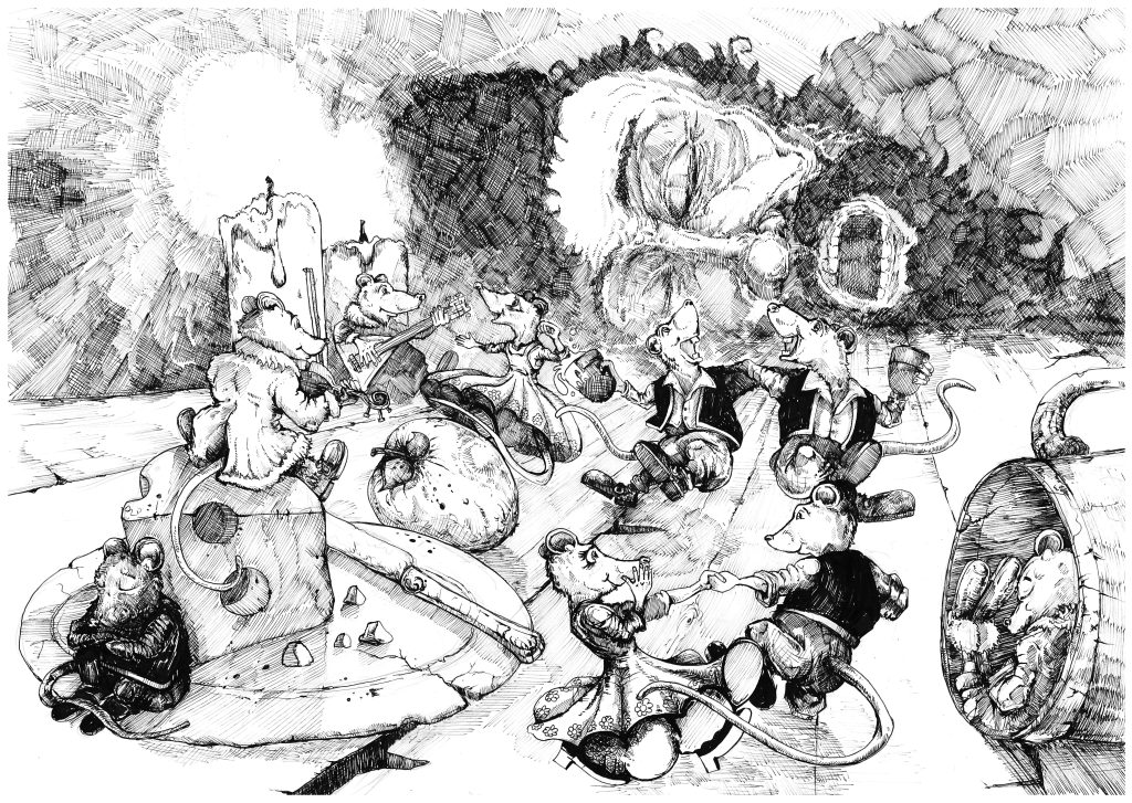
I think what strikes me is that I probably made a mistake drawing the final art 100% digitally when instead I should have gone the Catterwhip route of using pencil/ pen and just adding colour on the tablet, as my draughtsmanship is better with traditional media and I’d probably have had an easier time overall given the amount of fine detail needed. I do feel I’ve captured the feel of the original concept in the final draft, though.
Having seen this drawing again, I decided to keep it in the book on the author biog page at the end.
Also, rats’ feet are hard to draw with human-style shoes.
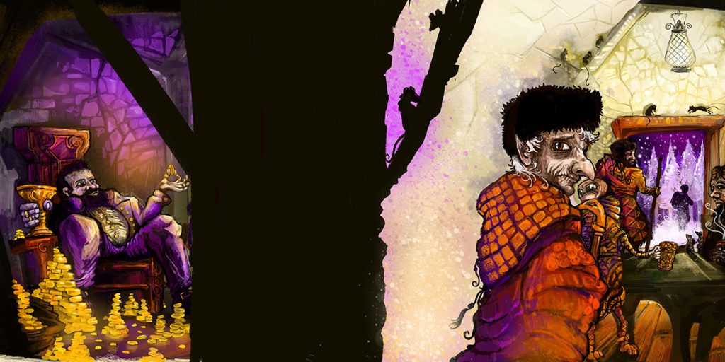
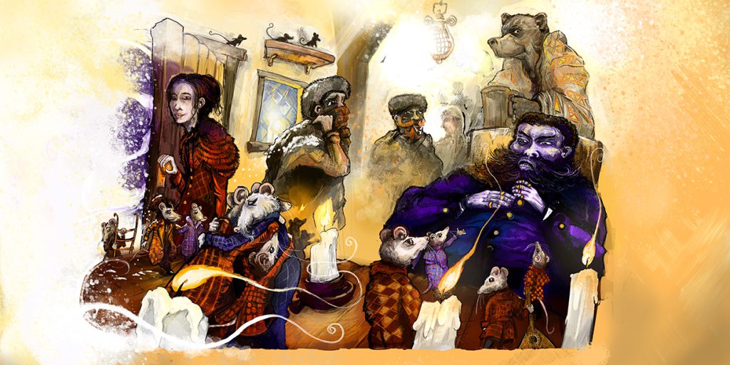
This is another page that went through a lot of revisions and is probably the most drastically removed from the earlier drafts. The pillar makes a nice contrasting backing for the text and covers a lot of original details. This was a text-heavy page and there were originally several more characters in the scene – several seated at tables and two travellers protesting to the new innkeeper who is now surrounded by piles of gold – a late addition.
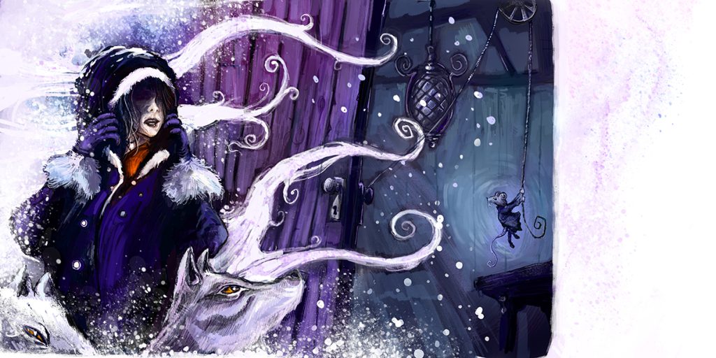
I brought the old innkeeper to the foreground of the right-hand page (originally she was in the doorway). Keen observers will recognise the Wishangrope having a last drink before also setting off – he’s the first hint that this takes place in the same world as The Squeeping Catterwhip.
I’m glad I made the decision to bring the old innkeeper to the fore – she is an important character and I wanted to have a hint at the conflict between her and her decision and the new owner of the inn. It also emphasises that the new innkeeper is unlike everyone else we’ve seen – his clothing matches the colour of everything cold outside and has no patterning – only gold buttons. Gradually this colouring pollutes the whole of the inn.
I didn’t want to overcrowd this scene with departing rats, but there are enough to show how many live in the inn. I chose rats because at the time of writing the very first draft (back around 2005) I kept two as pets. They’re lovely animals and very clever – but so many people asked why I’d keep (what they considered to be) such horrible animals in my house. Rats are very misunderstood and in the story the new innkeeper blames them for the exodus of travellers from the inn.
I’d originally intended this to be purely a story about immigrants finding their home, and so the publicly maligned rats seemed a good metaphor. Later it became more of an anti-capitalist tale, but immigrant workers fitted in well with this theme of prejudice, too.
Like the opening spread, I flipped this one horizontally and I feel it works better this way. It’s possibly my favourite page. As you can see, the new innkeeper has leeched all of the warm colours out of the book.
There’s a hint of red creeping back into the inn again.
The mysterious woman remains a mystery. In my original draft she was one of a race of spirits who walk the land and her purpose was to tell old Grandfather Rat that he had every right to run the inn – in the first draft, the old innkeeper dies of old age and no one accepts the rats as the new innkeepers, and so the inn becomes abandoned. I could never get this story to properly work and I liked having the greedy innkeeper villain.
She still is very much not human at all, but (unlike in most stories these days) I felt there was no need to explain are make a 3 hour movie giving her an origin story.
Sometimes the best people to be in charge are the ones who actually know how to do the work – this is another moral of this tale. I’m fed up with politicians and business advisors and career managers running services that they’ve no idea of the culture or practicalities off.
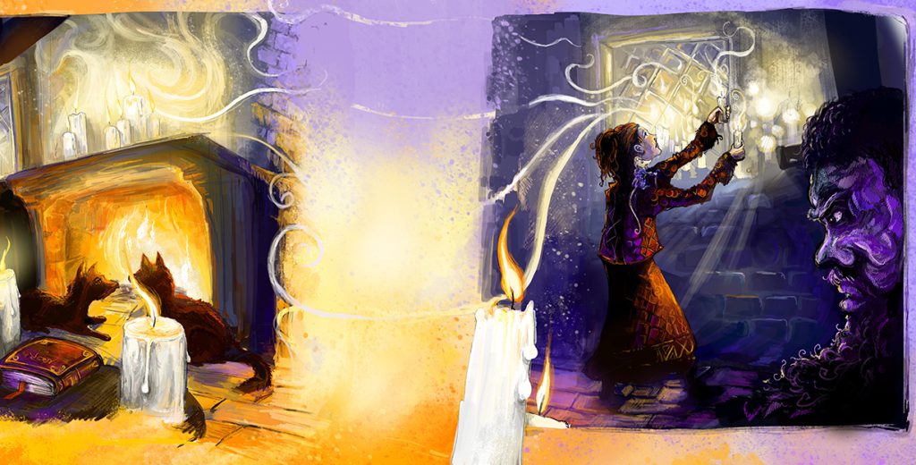
The woman starts vaguely resembling an old colleague of mine in this scene. The inn is being cleansed of the influence of the man – hint, gold is being returned to the inn, even if it’s not the gold that he expected.
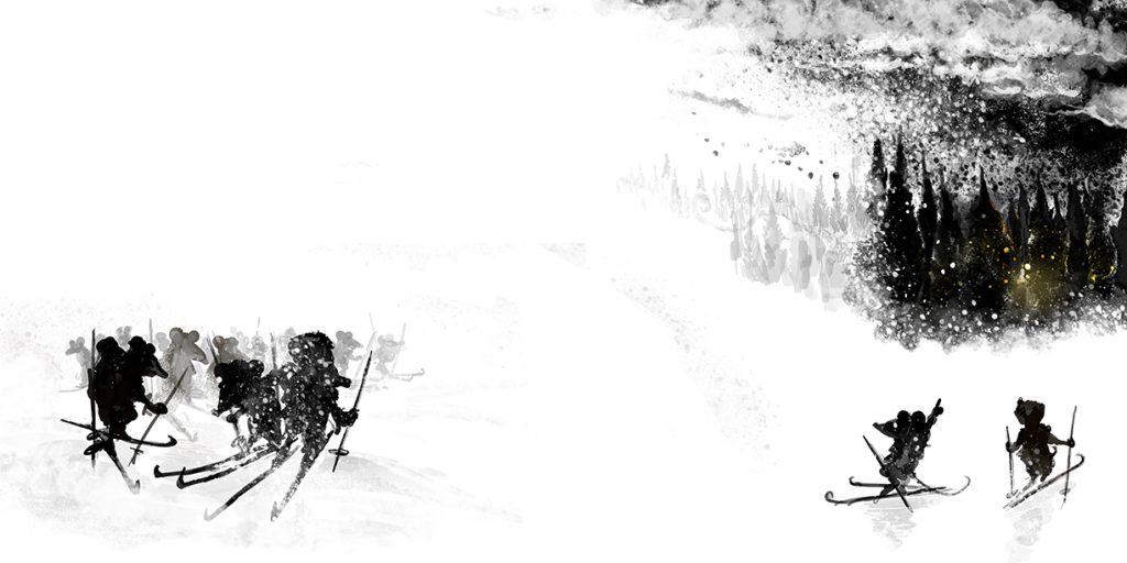
This spread felt like one of those jokes where you give someone a sheet of blank paper and tell them it’s a picture of a polar bear in a snowstorm.
It definitely stands out in the book, but I feel it fits and captures just how nasty this blizzard is – I needed a way of upping the ante from every other exterior scene in the book, and this was the one where the world turns truly hostile. This page also added weight to the last line of the story, as it gave me an opportunity to turn the concept of the value of glittering gold on its head. It was also nice to go back to silhouettes.
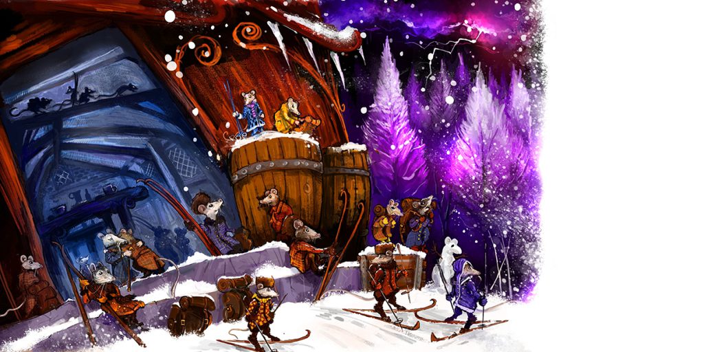
Things have come full circle now! I wanted to emphasise again how the inn is a lifeline and not a revenue generator (more management speak). This was another difficult spread to draw – the composition of the rats and human-sized characters was especially challenging, especially as I needed to have the inn in view, too.
I deliberately kept the man unchanged in colour and tone. It’s significant that he’s no longer polluting the inn with his colour palette, but he’s not changed a jot. This isn’t a story of redemption – he’s still a villain and doesn’t want to change, and the resolution is that he’s sent packing. Hopefully whoever’s doorstep he turns up on next will be able to see him off too. Sadly, greedy people are generally irredeemable and they’ll always be around. The important thing is knowing to recognise them for who they are.
The final scene and we start drawing back out into the distance. The man is off – possibly to go to work as a consultant for another privatised industry. Again, the purpose was to provide a clear resolution that all is well again at the inn.
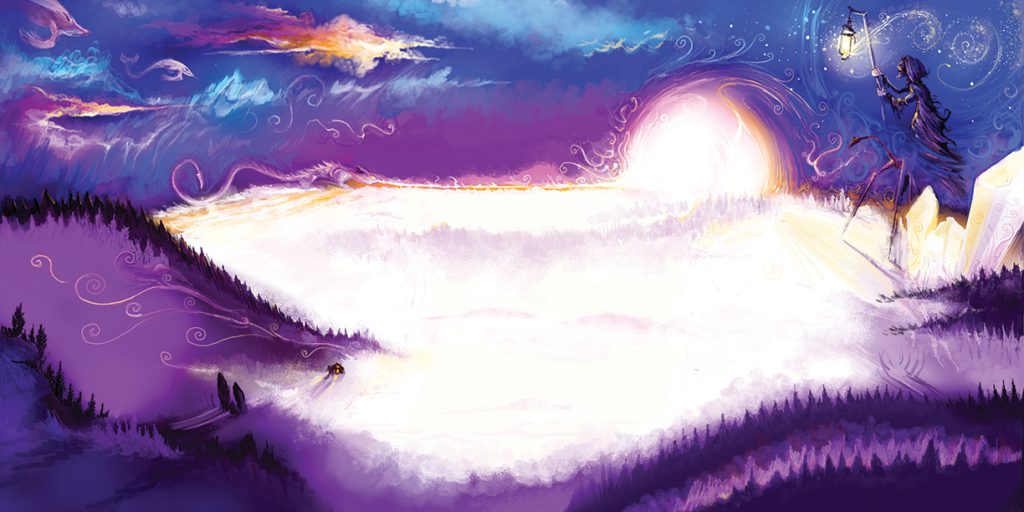
I do like these closing wordless spreads. Here the camera has zoomed out and shows again how big the world is and how the struggle at the inn is only one tiny story among millions. The world is also clearly magical (as all worlds are) and I’ve kept some creatures from the opening page as well as some nods to the opening of The Squeeping Catterwhip, including the sky whales and the lamplighter.